Re.Mind — Brand Identity & Platform Design
Brand Identity

The Challenge
Mental health platforms have a visual problem, and it runs deeper than aesthetics.
The category splits into two failed approaches. The first is clinical: muted blues, stock photography of people looking pensively out of windows, language borrowed from medical literature. It signals competence but feels cold — and for someone already anxious about reaching out, cold is a barrier. The second is the wellness aesthetic: soft gradients, lowercase serif type, endless talk of "journeys" and "self-care." It feels warm but signals that nothing serious is happening here — which undermines trust in the actual clinical work.
Re.Mind needed something neither approach delivers: a brand built around EMDR therapy that reads as genuinely credible and genuinely human at the same time. Trauma is heavy subject matter. The design had to hold that weight without either flattening it into clinical language or dressing it up in softness that doesn't survive contact with reality.


Brand Strategy & Positioning
Before a single screen was designed, we defined what the brand needed to accomplish emotionally.
The core insight: people seeking trauma therapy are often stuck in a specific psychological place — they know something is wrong, they've likely tried other approaches, and they're carrying a quiet fear that they're beyond help. The brand's job was to interrupt that story. Not with false optimism, but with a tone that says this is workable, and you're not the only one.
That produced the platform's central message: "Because your past shouldn't define your future." Direct, non-clinical, and honest about the problem while pointing at the exit. Everything else in the identity flows from that line.
Supporting language followed the same rule — plainspoken, occasionally funny, never patronising. Refocus. Reframe. Remind. Shift happens. We've got you. The humour matters: it signals a human being wrote this, and it gives an anxious reader permission to breathe.
Visual Identity


Colour
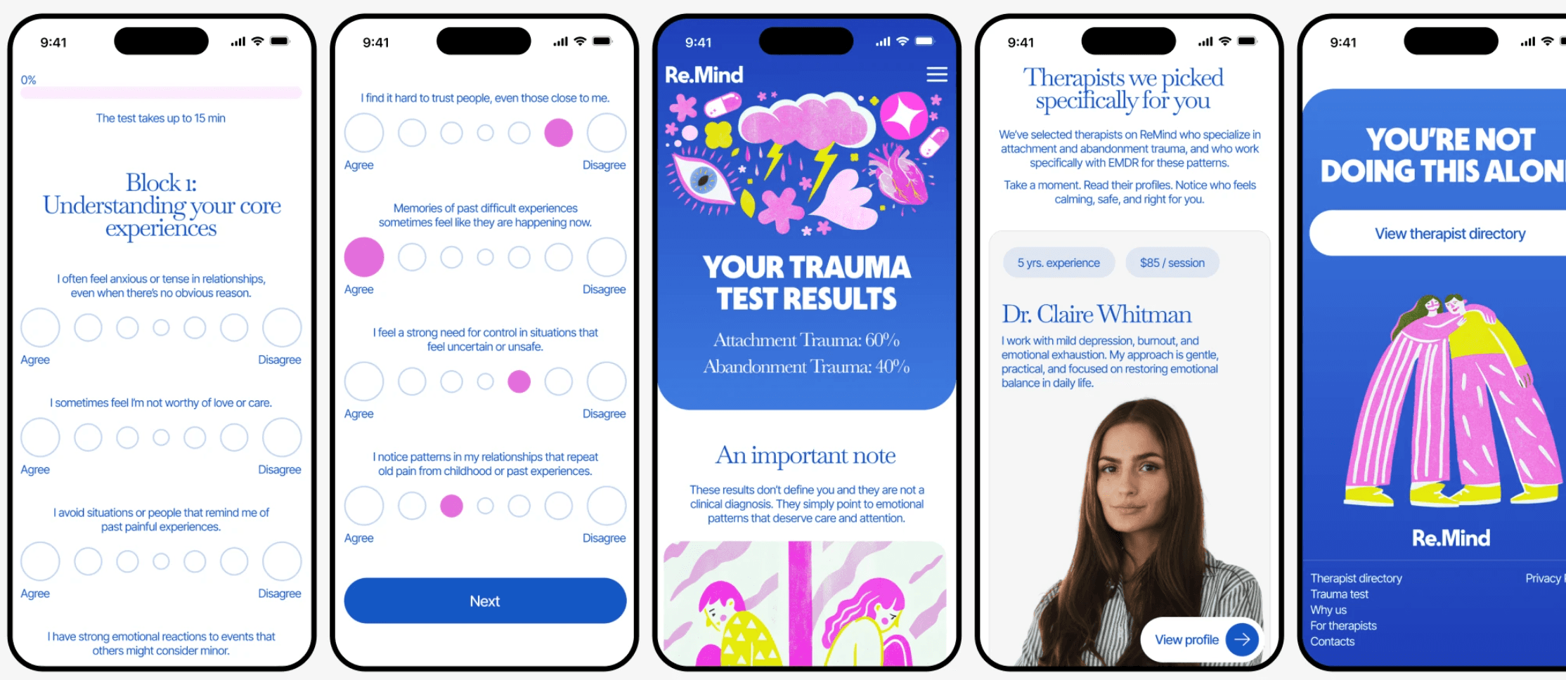
Colour is the fastest-acting element in any brand. Long before a visitor reads a word, the palette has already told them whether you are warm or clinical, serious or amateur, safe or intimidating. In mental health especially, that split-second impression decides whether someone stays on the page or closes the tab.
Our approach is always psychological before it is aesthetic. We ask what emotional state your patients are in when they arrive — anxious, exhausted, sceptical, hopeful — and build a palette that meets them there. Warmer, softer tones create comfort and lower a visitor's guard. Deeper, more confident tones carry authority and clinical credibility. The craft lies in the balance between them: too much warmth and a practice reads as unserious; too much restraint and it reads as cold and unapproachable. Getting that ratio right is the difference between a brand that feels human and one that feels like a hospital waiting room.
We layer in accent colours sparingly, to create energy and direct attention exactly where it matters — a booking button, a key statement, a moment that needs to land. And we build generous white space throughout, because when your subject is overwhelm, the page itself should never feel overwhelming.
Every palette we develop is documented as a system with defined roles, so it stays coherent as your brand grows across a website, social media, print, and everything after.
Typography
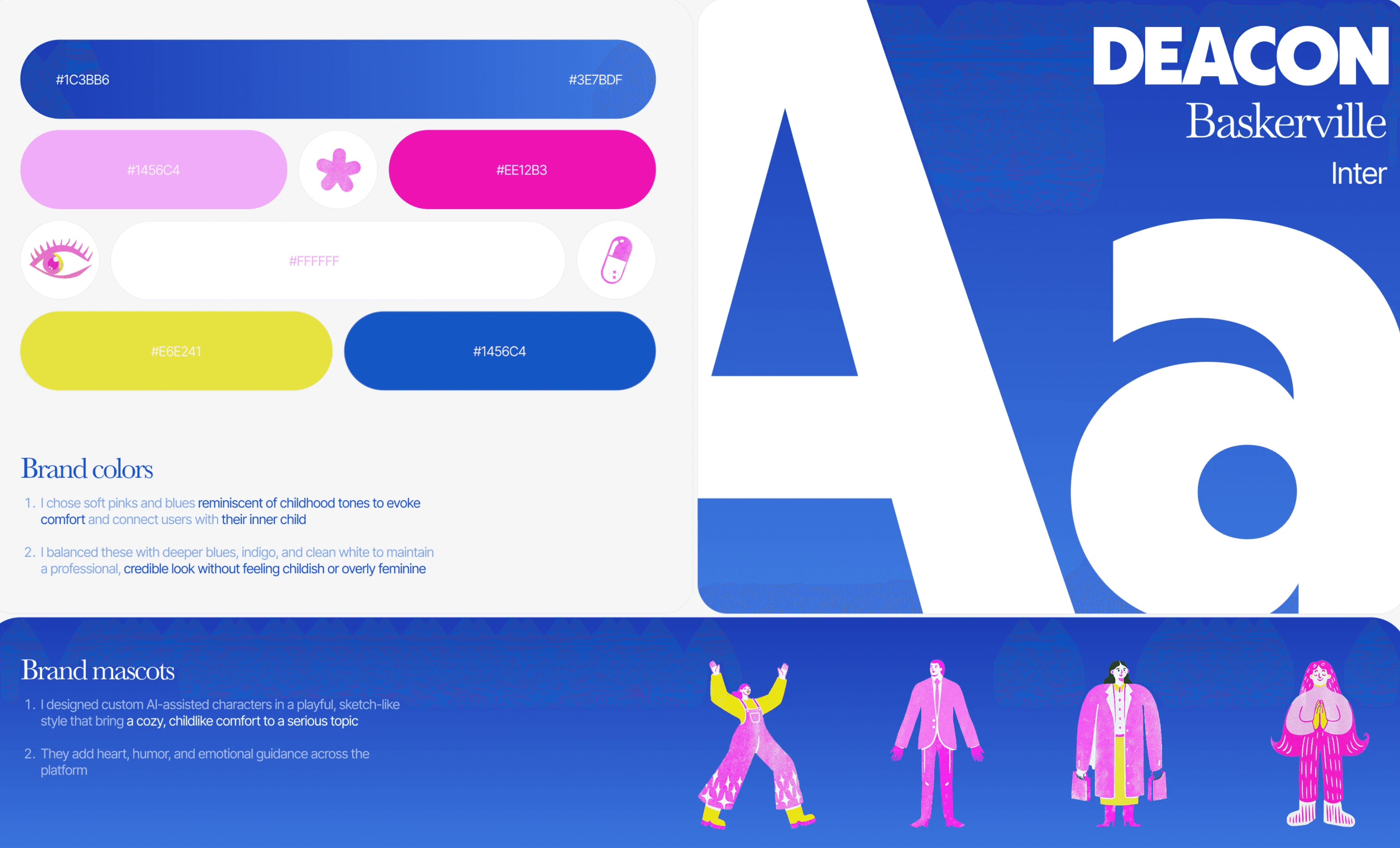
Typography is tone of voice made visible. The same sentence reads as authoritative, gentle, or careless depending entirely on the type it is set in — and most practices never think about it at all.
We typically build around a small family of complementary typefaces, each with a defined job. A display face carries headlines and gives the brand presence and confidence. A secondary face brings warmth and humanity to editorial moments and mid-level headings. A dedicated interface face handles body copy and navigation, chosen purely for legibility across devices and reading conditions — because dense, difficult text is the fastest way to lose a reader who is already low on energy.
The deliberate tension between those faces is what gives a brand character. Authority alone feels institutional. Warmth alone feels amateur. Together, and used with clear rules about where each belongs, they create something that reads as considered — which is exactly the impression a mental health professional wants to give.
Illustration & Brand Mascots
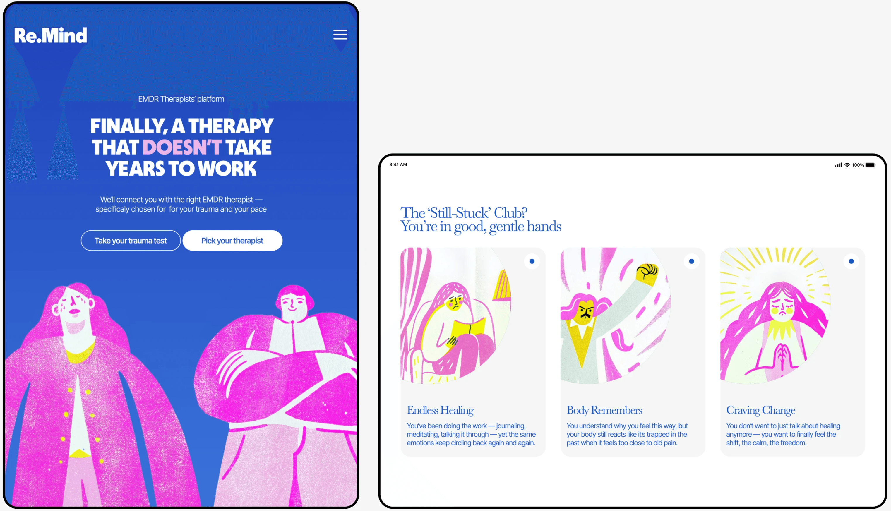
Rather than stock photography, we developed a custom cast of illustrated characters in a playful, sketch-like style with a risograph-inspired grain.
These mascots do specific work. They bring cozy, childlike comfort to a serious topic. They allow the platform to depict emotional states — frustration, relief, being held, being stuck — that photography would either dramatise or sanitise. And they add heart, humour, and emotional guidance throughout the experience, appearing at exactly the moments a user might otherwise feel alone on a page.
The accompanying icon system — the eye (EMDR's bilateral stimulation), the broken heart, the capsule, the flower forms, the spark — creates a visual shorthand that's immediately readable and entirely ownable.
Product & Experience Design
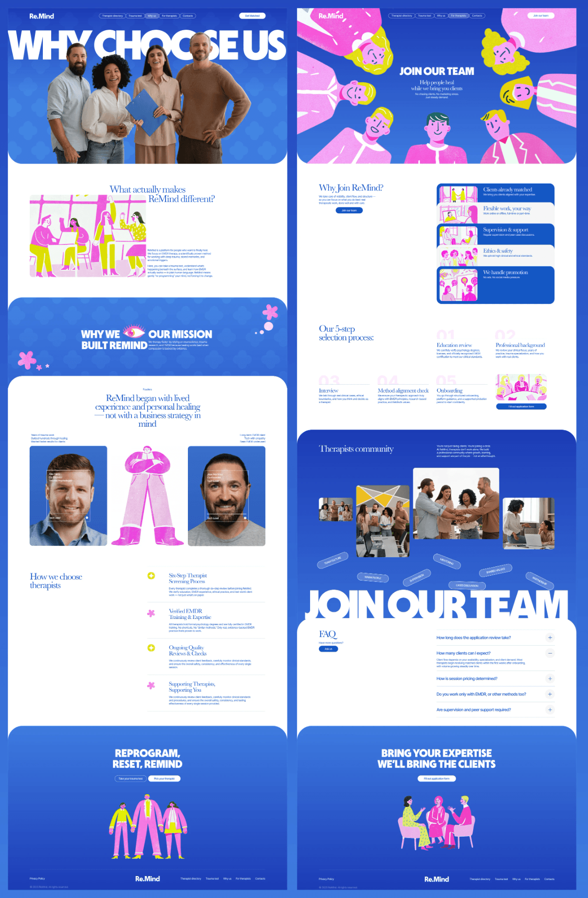
Dual-Path Customer Journey
The most important structural decision in the project.
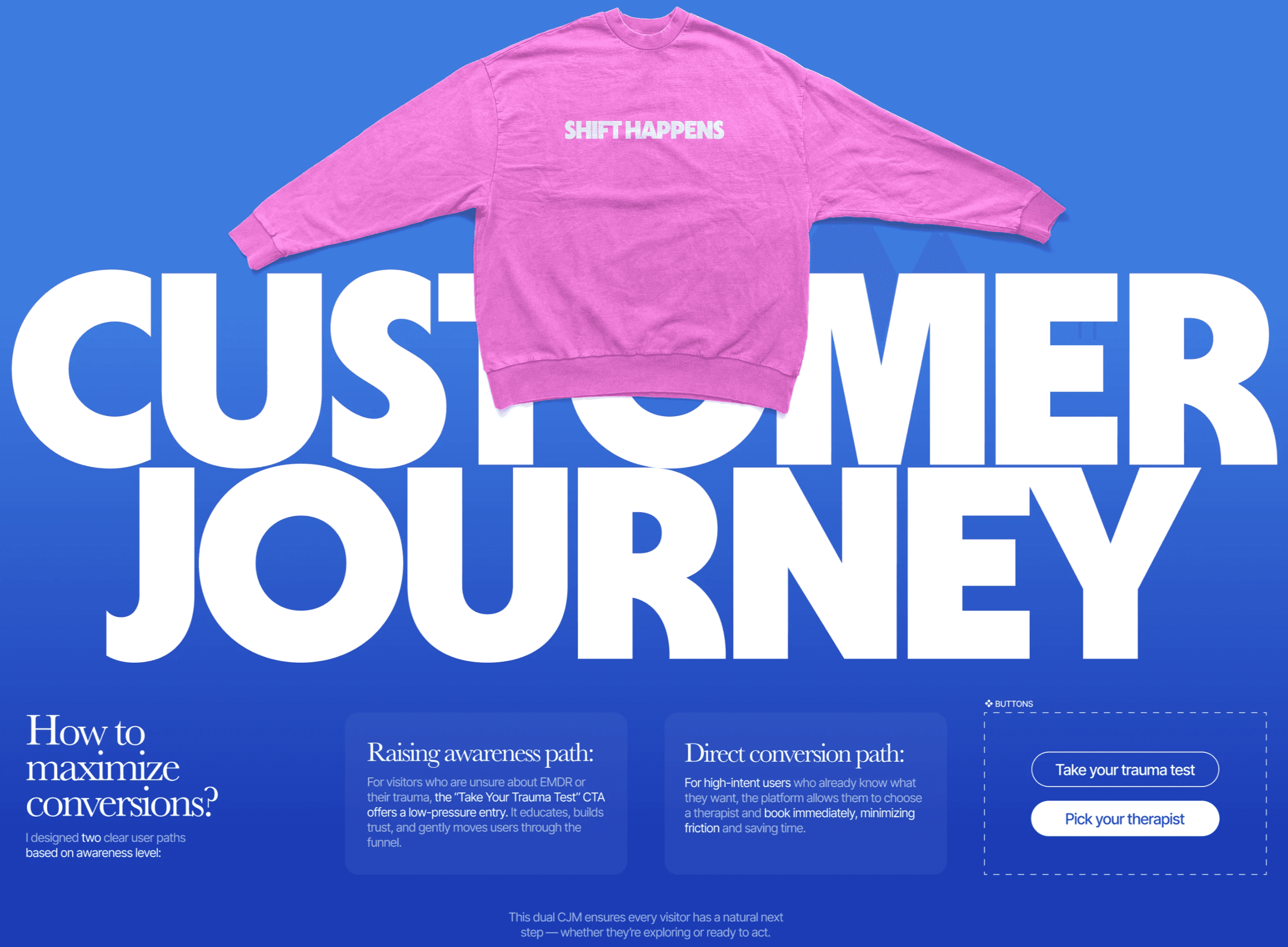
Visitors to a mental health platform arrive at radically different levels of readiness, and forcing them down a single funnel loses most of them. We designed two clear paths based on awareness level:
The awareness path. For visitors unsure about EMDR, unsure about their own trauma, or simply not ready to commit — the "Take Your Trauma Test" CTA offers a low-pressure entry point. It educates, builds trust, and moves users gently through the funnel without ever asking them to make a decision they aren't ready for.
The direct conversion path. For high-intent users who already know what they want — "Pick Your Therapist" lets them browse the directory and book immediately, minimising friction and saving time.
This dual architecture ensures every visitor has a natural next step, whether they're exploring or ready to act. It's the single biggest driver of conversion performance in the entire design.
Therapist Directory & Profiles
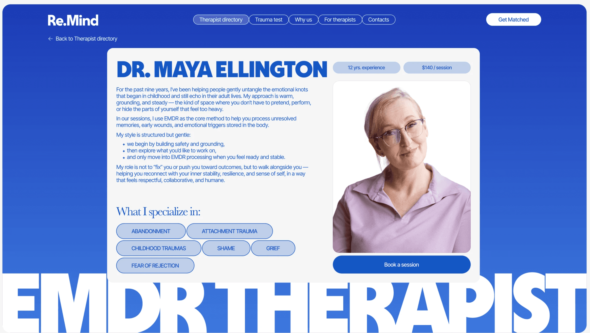
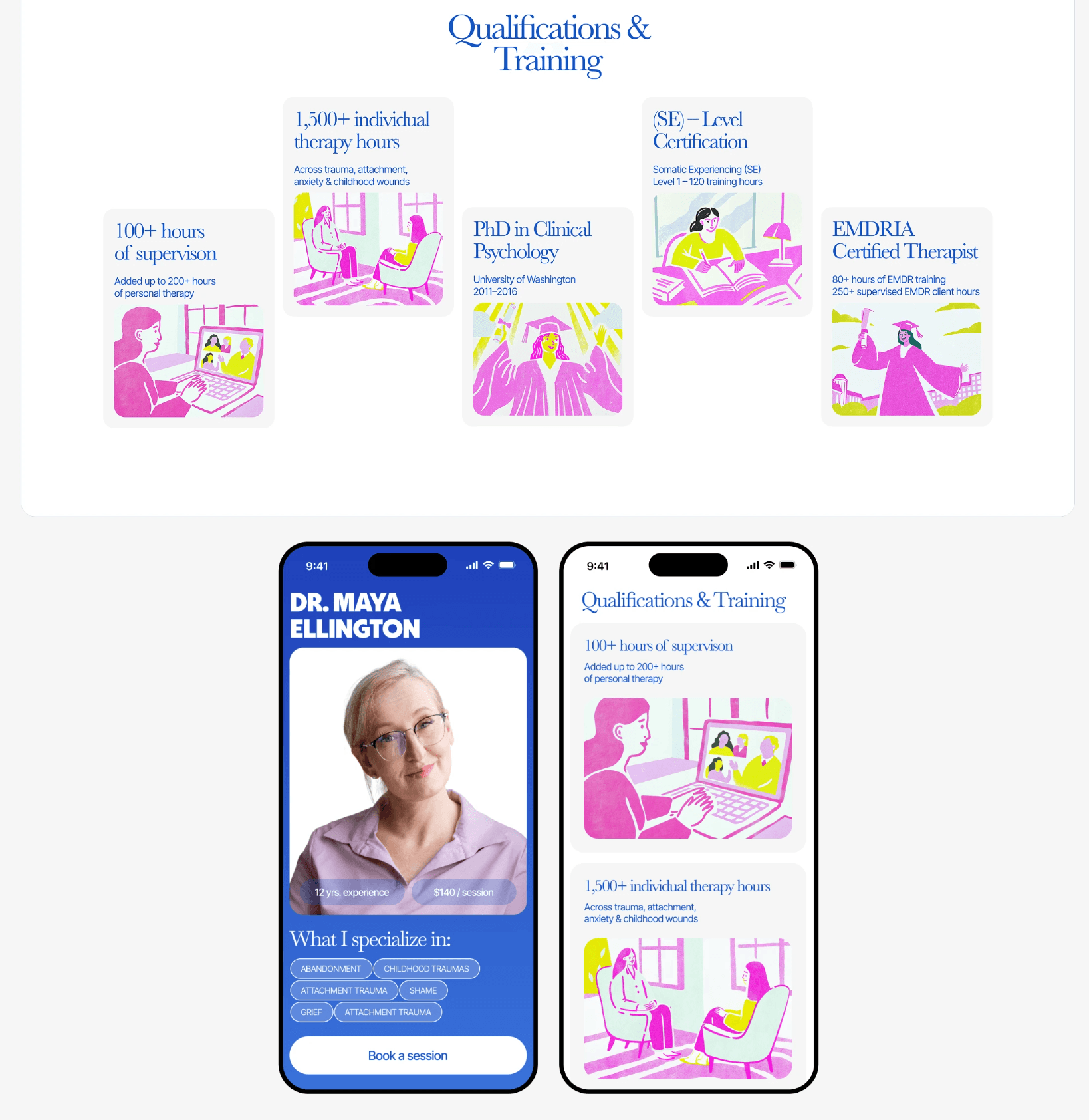
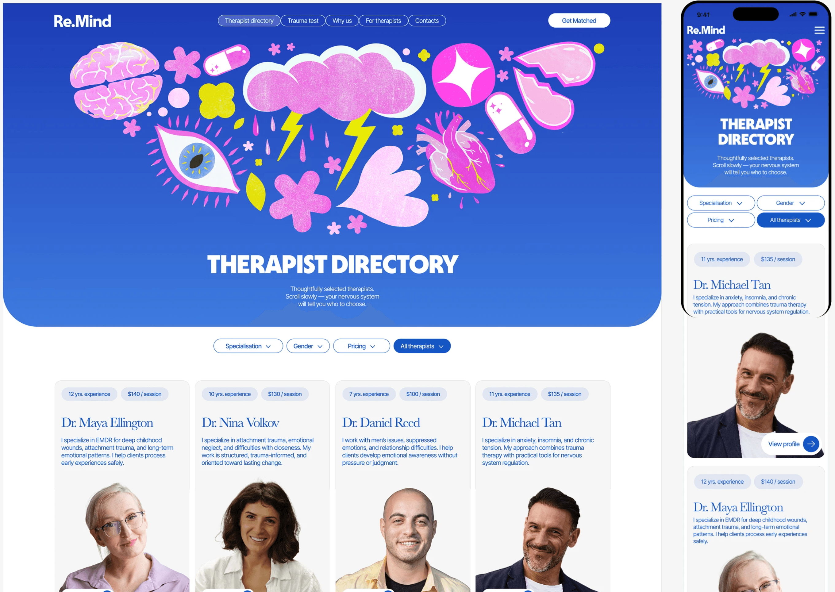
The directory was designed to solve the discovery problem that plagues every platform in this space: when every profile looks identical, choosing becomes paralysing.
Individual therapist pages give each practitioner room to sound like a person — a first-person introduction written in their own voice, a clear description of their method and session structure, and a specialisation tag system that lets a user recognise their own situation instantly (abandonment, attachment trauma, shame, grief, fear of rejection). Experience and pricing appear upfront, removing the awkwardness of having to ask.
The result is a directory where a user isn't comparing credentials — they're recognising a fit.
The "For Therapists" Side
A two-sided platform needs two-sided design. The therapist-facing experience was built around a different emotional need entirely: practitioners who want to focus on clinical work, not marketing.
The messaging — "Help people heal while we bring you clients. No chasing clients. No marketing stress. Just steady demand" — speaks directly to the business anxiety most therapists carry quietly. Supporting sections explain the five-step selection process, the community, and the support structure, building confidence in the platform's standards from both sides.
Why a Dashboard Changes Everything
The management dashboard is where a brand stops being a look and becomes a working business asset.
It replaces guessing with knowing. Most practitioners have no reliable answer to "where are my clients actually coming from?" A dashboard surfaces inquiries, bookings, traffic sources, and engagement in one place, in real time. Decisions stop being intuition and start being informed.
It builds trust through transparency. When a practitioner can see exactly what's happening — which pages convert, which specialisations attract inquiries, how the week compares to the last — there's no black box and no need to take anyone's word for anything.
It turns a website into infrastructure. A static site is a brochure. A site with a dashboard behind it is an operating system for the practice: capacity planning, seasonal patterns, understanding which services to expand.
It compounds over time. Every month of data makes the next month's decisions sharper. The dashboard becomes more valuable the longer it runs — which is exactly the opposite of how most marketing assets age.
Extending the Brand Beyond the Screen
A digital identity that only lives online is only half-built. We extended the Re.Mind system across physical and cultural touchpoints:
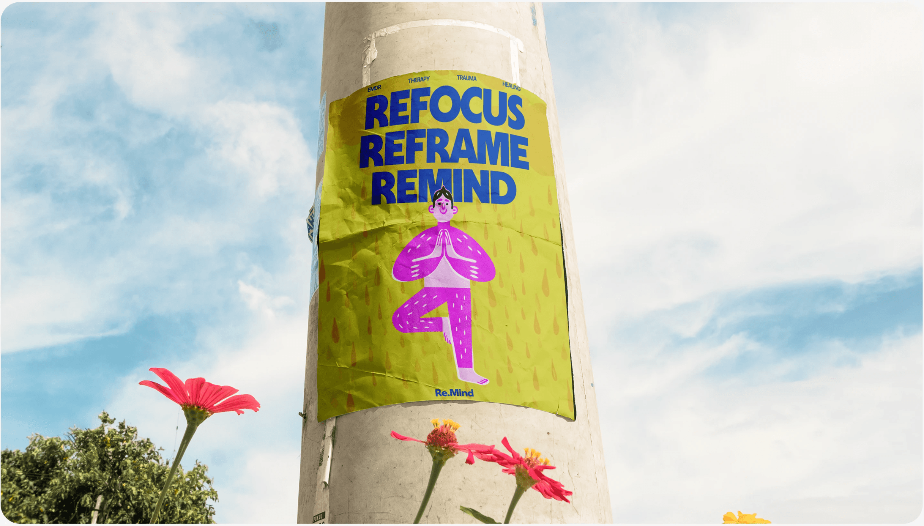
Merchandise — apparel carrying the illustration system and brand messaging, turning users into visible advocates in a category where visible advocacy is rare and powerful.
Street posters — bold, arresting outdoor executions that place mental health language in public space, normalising the conversation while driving awareness.
Packaging & physical collateral — branded cup designs and print materials that extend the identity into everyday moments, building familiarity before someone ever visits the site.
Social-first assets — a system of shareable graphics and post templates that keep the brand consistent across channels without requiring design work every time.
This is the difference between a website and a brand. A website is found. A brand is recognised — and recognition is what turns a first impression into a decision.
Our Process
Discovery & Strategy. We start with the emotional problem, not the visual one. Who is the user, what state are they in when they arrive, and what does the brand need to make them feel before it can make them act?
Brand Architecture. Colour, typography, illustration, tone of voice, and iconography developed as one interdependent system — with documented rules so the brand stays coherent as it scales.
UX & Conversion Design. User journeys mapped by awareness level, with CTAs and page structures designed around real decision-making behaviour rather than assumed linear funnels.
UI & Visual Design. Full interface design across desktop, tablet, and mobile, with responsive behaviour considered from the first screen rather than retrofitted.
Brand Extension. Merchandise, print, outdoor, packaging, and social systems that carry the identity beyond the browser.
Build & Handover. Production-ready files, documented design systems, and dashboard integration — everything needed to run and grow the platform.
How PsyConsulting Builds This For You
Most practitioners understand they need a website. Far fewer understand that a website is only the visible surface of something much larger — and that the difference between a practice that grows and one that stays invisible is usually everything happening underneath.
Graphic design, in our world, is not decoration. It is the first conversation you have with someone who is struggling. Before a single word is read, colour, typography, spacing, and imagery have already told that person whether you are warm or cold, serious or amateur, safe or clinical. We build complete visual identities for mental health professionals — palettes chosen for the specific emotional state your patients arrive in, typography that carries authority without intimidation, illustration and iconography that let you show emotion without resorting to the same stock photography every competitor is using. The result is a brand that is unmistakably yours, consistent across every surface, and impossible to confuse with the practice down the street.
Your website is where that identity does its work. We design and build sites engineered around how people actually decide — not a single narrow funnel, but multiple paths for visitors arriving at different levels of readiness. Someone who knows exactly what they need can book in two clicks. Someone still unsure gets an educational entry point that builds trust before asking for anything. Every page is structured to convert quietly and ethically, with integrated booking, mobile-first performance, search visibility built into the foundation rather than bolted on afterwards, and content architecture designed to grow with you rather than need rebuilding in eighteen months.
And then there is the part almost no one offers a private practice: your own management dashboard. This is where marketing stops being a leap of faith. Instead of wondering whether any of it is working, you see it — where inquiries come from, which pages convert, how bookings trend week to week, what your busiest periods look like, which specialisations attract the most interest. You stop making decisions on intuition and start making them on evidence. You can plan capacity, spot problems early, and know with certainty what deserves more investment. Most practitioners have never had this visibility over their own practice, and it changes how they run it.
We handle all of it — identity, website, content, visibility, and the infrastructure that tracks it — as one connected system rather than disconnected services from different suppliers. That is the entire point. A brand that looks premium but converts poorly is a waste of money. A site that converts but looks generic caps your pricing. A campaign with no measurement is guesswork you pay for monthly. Built together, each part strengthens the others, and the whole thing compounds.
You focus on your patients. We make sure the people who need you can find you, trust you, and reach you.
What This Demonstrates
This project shows what's possible when a mental health brand refuses the default. It's proof that clinical credibility and genuine human warmth aren't a trade-off — that a platform can take trauma seriously and still feel like somewhere you'd want to be.
Every decision, from the colour palette's inner-child logic to the dual-path conversion architecture, was made to solve a specific problem for a specific person in a specific emotional state.
That's the standard we bring to every practice we work with.