Nadine Silva — Visual Identity & Paid Acquisition
Customer

The Client
Nadine Silva is a psychologist in private practice with genuine clinical depth and a clear sense of the people she wants to reach — adults carrying body image struggles, emotional blocks, unresolved patterns from the past, and the particular weight that comes with motherhood.
Like most skilled practitioners, her problem was never the quality of her work. It was that the people who needed her most had no way of finding her.
The Challenge
Nadine faced the same three barriers that quietly limit almost every private practice.
Invisibility. Her expertise existed almost entirely inside the consulting room. Someone lying awake at 2am searching for help with emotional blocks or postnatal overwhelm would never encounter her — they'd find whoever happened to be running ads or ranking first.
Sameness. Mental health content online has settled into a visual monoculture: soft gradients, pastel palettes, generic stock photography, quotes in thin serif type. Even excellent practitioners disappear into it. Scrolling past ten therapist profiles, nothing distinguishes one from the next.
No acquisition system. Referrals and word of mouth are wonderful, but they're unpredictable and they plateau. Nadine had no reliable, repeatable way to bring new patients into her practice — which meant income and caseload swung month to month.


Our Approach
Building a Visual Identity That Interrupts the Scroll
The strategic decision that shaped everything: refuse the category's default aesthetic entirely.
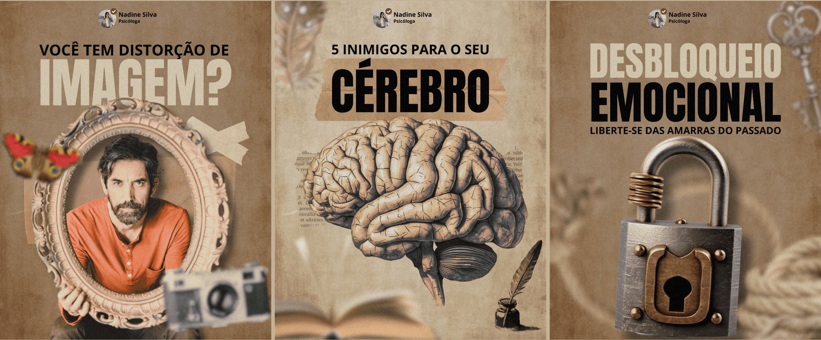
Instead of the expected softness, we built Nadine's visual language around a vintage editorial collage system — aged paper textures, antique photography, tape and stamp elements, heavy condensed display typography, and a warm sepia palette that feels closer to a rediscovered archive than a wellness brand.
This wasn't decoration. It was a targeted solution to a specific problem:
It stops the scroll. In a feed saturated with pale gradients, warm brown and heavy black type is genuinely disruptive. The eye catches on it because it doesn't look like anything around it.
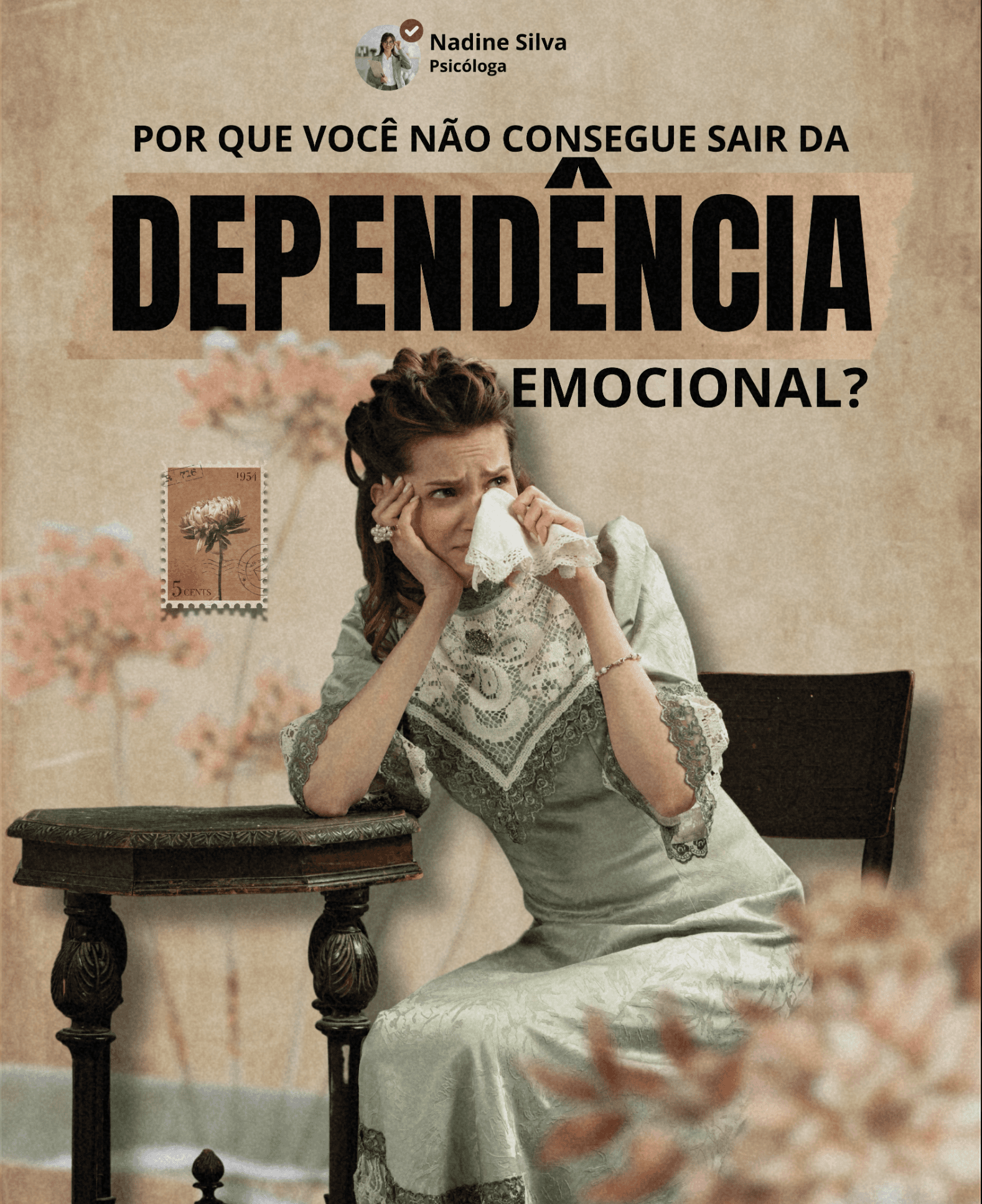
It carries emotional weight without being grim. The vintage register lets us handle difficult subject matter — image distortion, emotional imprisonment, maternal mental health — with gravity and beauty at the same time. A padlock for emotional blocks. An ornate frame for body image. A woman in period dress with a handkerchief for grief. These images say something true without being clinical or bleak.
It signals seriousness. The typography is confident and unapologetic. It tells a viewer, before they read a word, that this practitioner takes her work seriously — which is precisely the impression that converts a scroller into an inquiry.
It's unmistakably hers. Every post reinforces the same visual world. Someone who sees three of Nadine's posts across a few weeks recognises the fourth instantly. That recognition is what turns visibility into trust.
Her name, photo, and title appear consistently at the top of each piece — so the brand being built is always hers, never an anonymous account.
Content Strategy Built on Real Search Behaviour
The subject matter wasn't chosen for aesthetics. Each piece targets a specific psychological state people actively search for and struggle to name:
Body image distortion and self-perception
The cognitive patterns working against emotional wellbeing
Emotional blocks and being trapped by the past
Maternal mental health
Each one functions as a hook for someone who recognises themselves in it — and each one gives Nadine a natural, non-salesy way to demonstrate expertise before anyone books anything.
Meta Advertising
Organic reach alone was never going to solve the visibility problem, so we built targeted paid campaigns across Facebook and Instagram.
The approach was deliberately layered. Cold audiences were reached through interest and behavioural targeting designed to find people already engaging with mental health, parenting, and personal development content. Warm audiences — people who'd watched a video, engaged with a post, or visited the profile — received different creative designed to move them closer to booking.
Because the creative was already visually distinctive, it did something most therapy ads can't: it earned attention rather than buying it at premium cost. Ad creative that stops the scroll organically performs better paid, because the platform rewards engagement with cheaper distribution.
We also navigated the platform's health-and-wellness advertising restrictions carefully — writing copy and structuring campaigns to stay fully compliant while still reaching the right people. This is where most practitioners get stuck or get their accounts flagged.
Google Visibility & Search
Meta reaches people before they know they need help. Google catches them at the moment they've decided to act — and that moment is far too valuable to lose to a directory listing.
We built Nadine's search presence around the specific terms her future patients actually type: her specialisations, her location, and the emotional language people use when describing what they're going through. The goal was simple and non-negotiable — when someone in her area searches for exactly what she offers, her name appears, not a platform's.
The Result
Nadine now has three things she didn't have before, and they compound.
A brand that's recognised, not just seen. Her visual identity is consistent, distinctive, and entirely her own — working across every platform and every format, building familiarity with every impression.
A reliable acquisition system. Instead of waiting for referrals, there's a working channel: content that attracts, ads that reach, and search visibility that captures intent. Predictable rather than seasonal.
Authority in her niche. Consistent, thoughtful content on body image, emotional blocks, and maternal mental health positions her as the practitioner who genuinely understands those specific struggles — not a generalist competing on price.
Most importantly: the people who need exactly what Nadine offers can now find her. That was the entire point.
What This Demonstrates
This project shows what happens when brand design and paid acquisition are built as one system rather than bought separately.
A beautiful identity with no distribution reaches nobody. Ad spend behind generic creative burns money. Built together, each part makes the other work harder — the design earns cheaper reach, and the reach makes the design worth having.
That's the standard we bring to every practice we work with.